Unimo
Brand Identity
ABOUT UNIMO
Unimo is the private investment network for the planet. Unimo’s mission is to remove the current difficulties found in the existing investment platforms.
Unimo offers easy access to the world’s largest portfolio of private investment and philanthropic opportunities, each carefully selected to deliver a positive impact to the global economy, humanity, society, and the planet.
THE BRIEF
We were tasked with creating a new brand identity for Unimo. It was important that the identity balanced Unimo’s characteristics of dynamic change with a trustworthy and stable identity.
OUR APPROACH
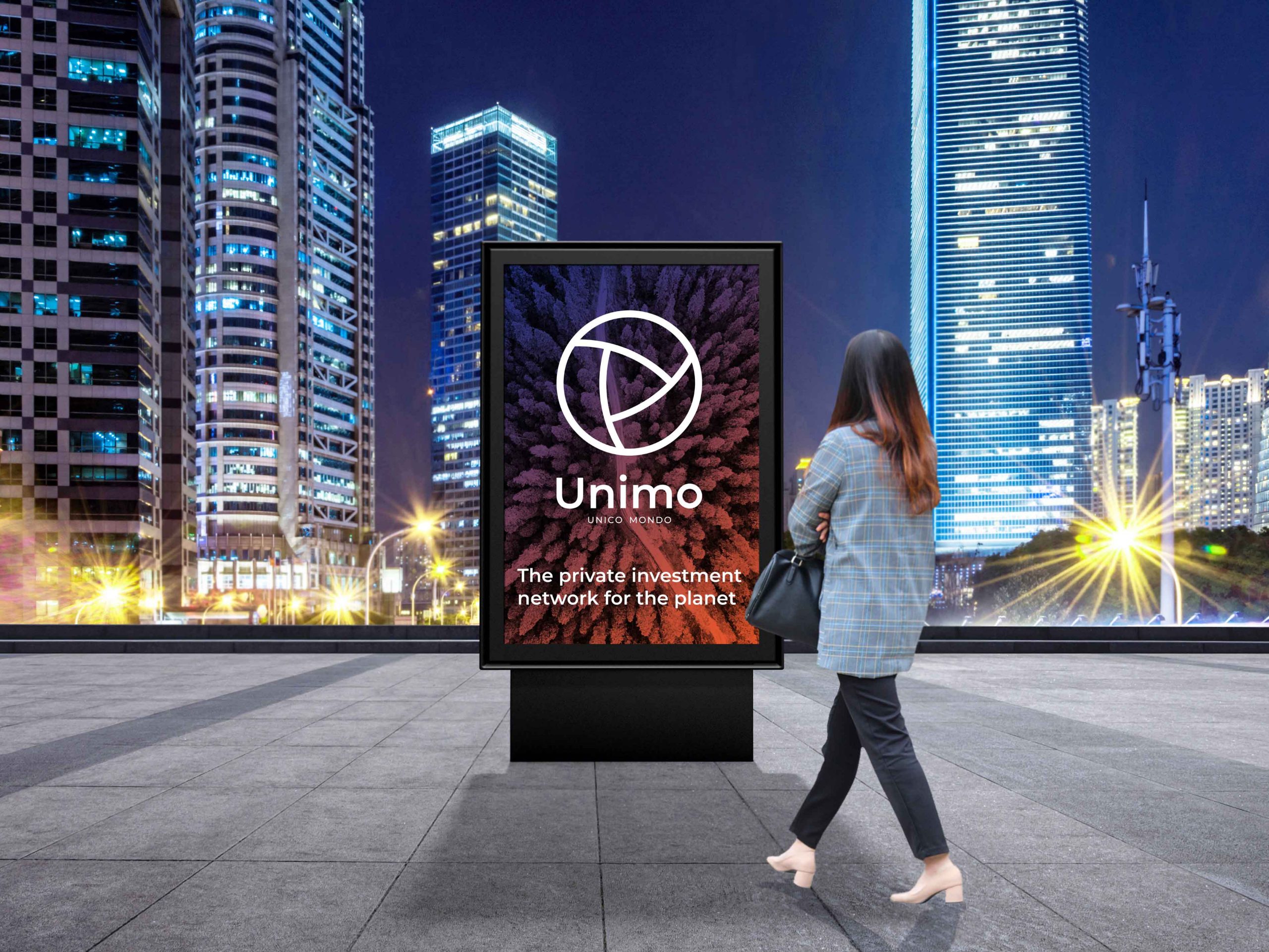
Our approach focused on ‘balance’ – the balance between disruption and stability. The balance between tradition and future. The balance between global and local. Ensuring that Unimo is positioned as an exciting tool for change while also providing the reassurance required for a finance industry brand.
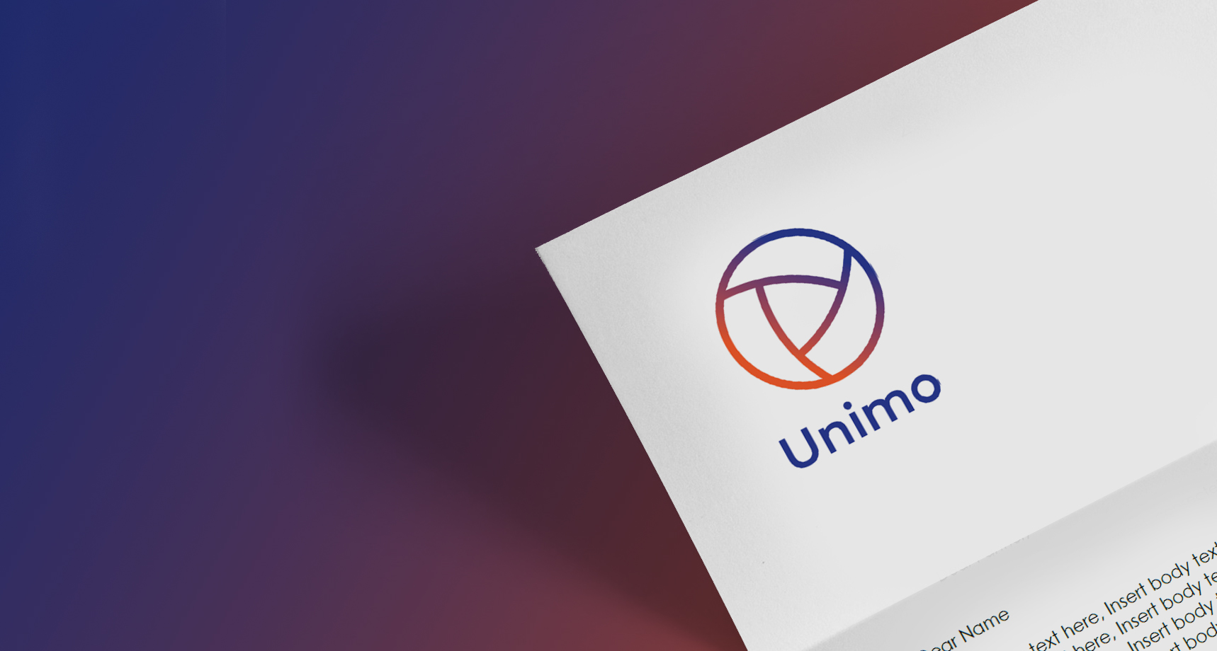
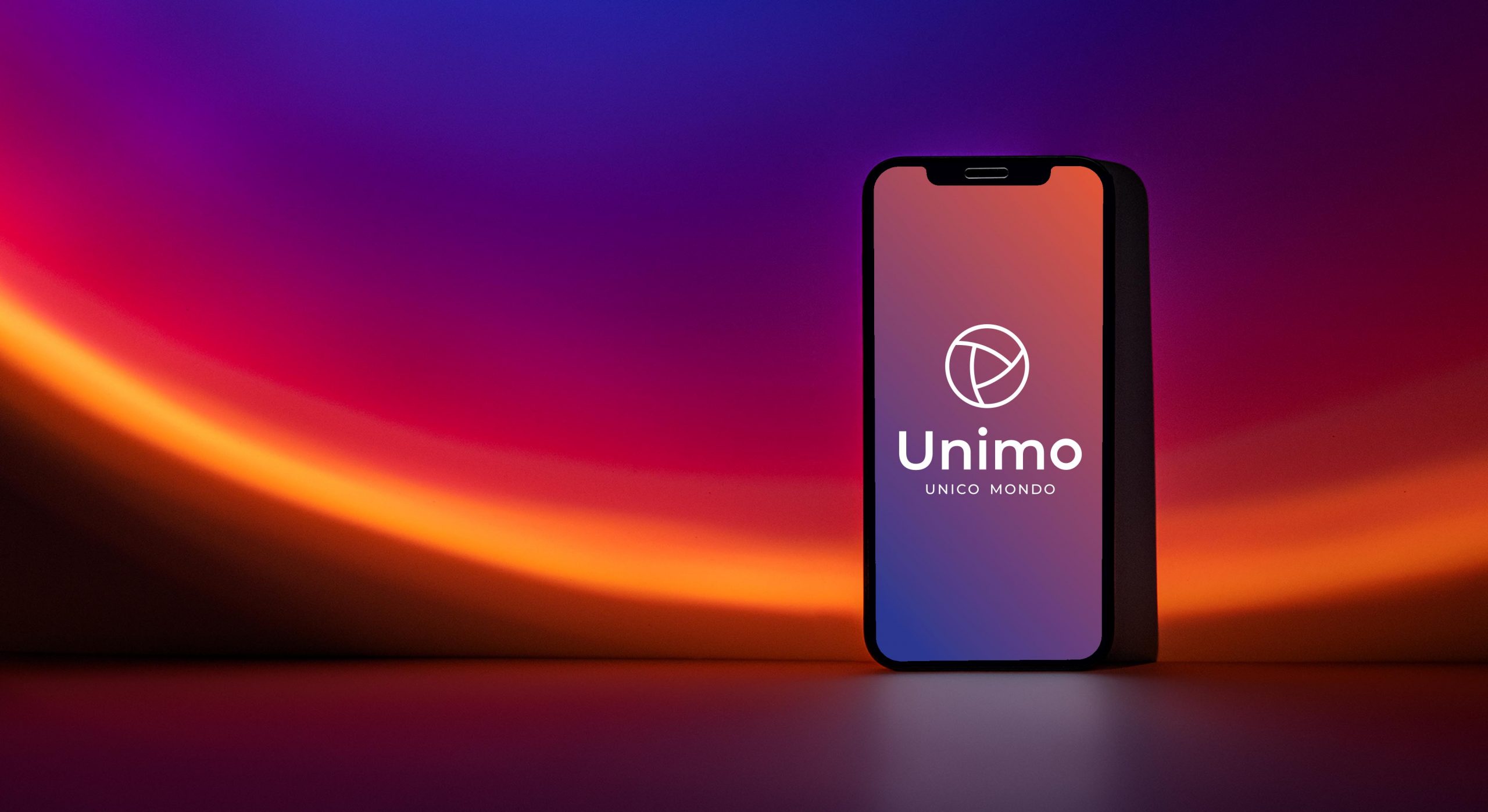
The name “Unimo” is an amalgamation of the Italian phrase “Unico Mondo” meaning “One World”, the brand icon is designed to reference the globe. The icon is formed by three equal parts, representing the investor, company and broker; at the centre Unimo brings all parties together.
The combination of orange and blue embodies the bringing together of new and old that Unimo represents, evoking the feeling of a new dawn.
THE RESULTS
Unimo Founder and CEO Kent Moerk, describes the new brand identity as “It’s spot on. It’s fresh, it’s bold, but not too bold. It’s not too corporate, but still very professional.”
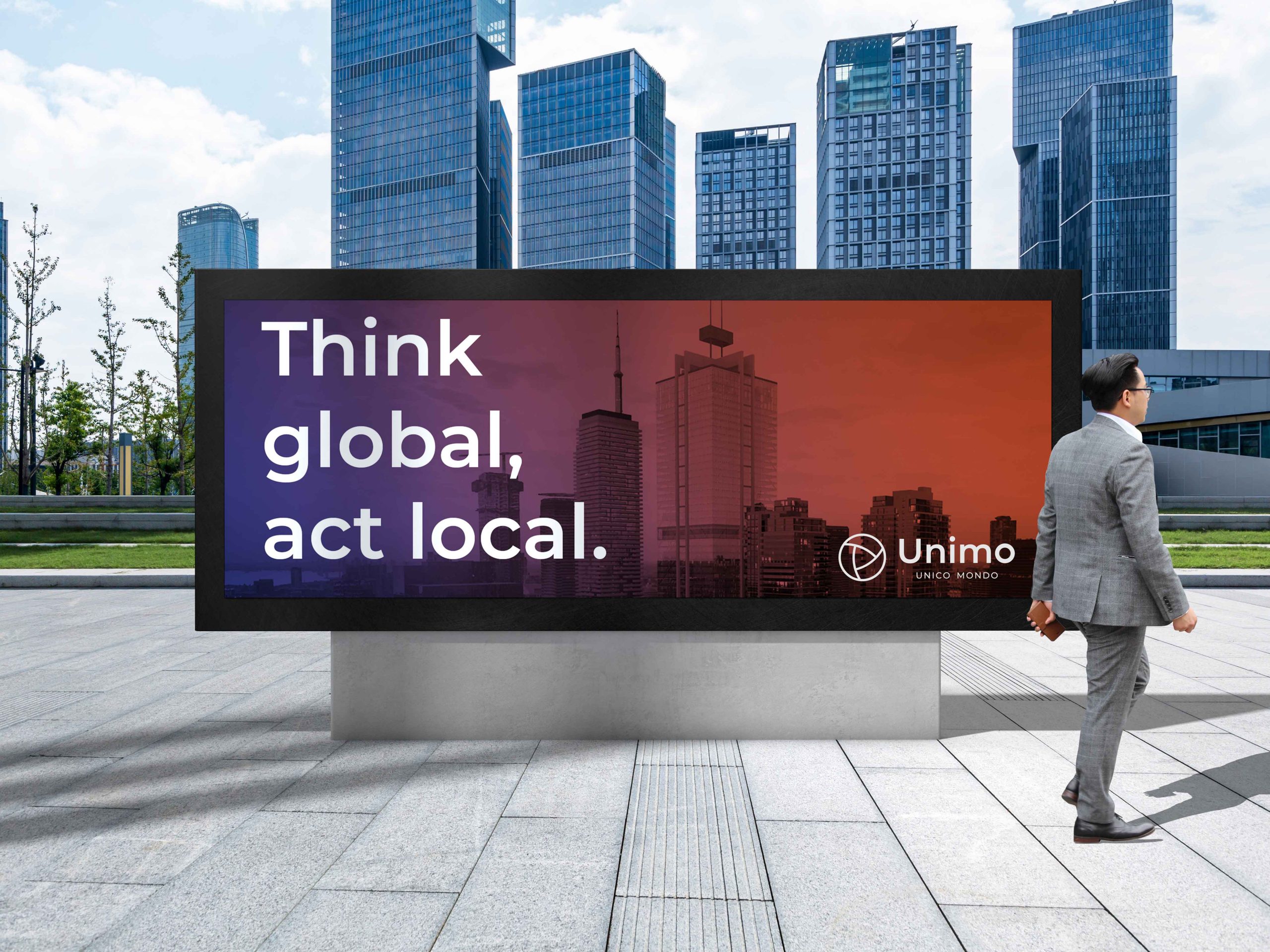
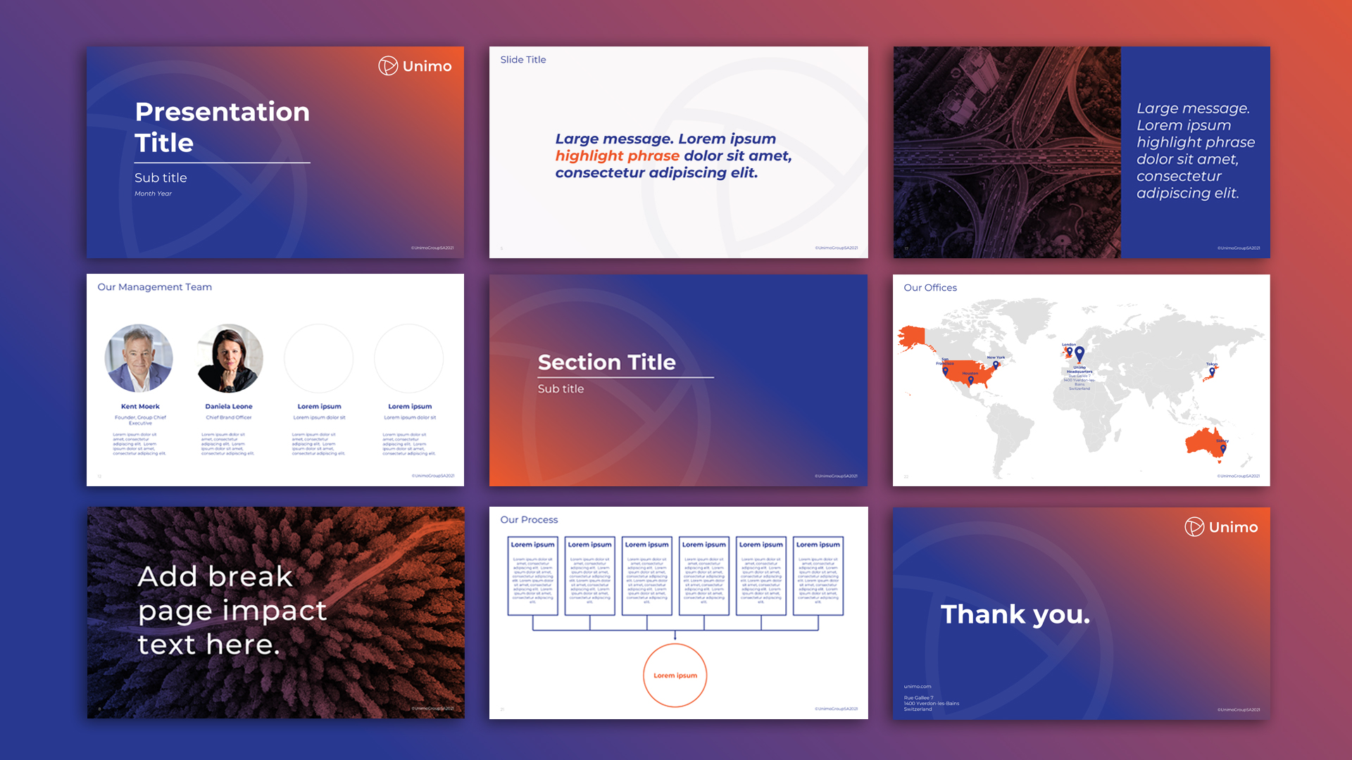
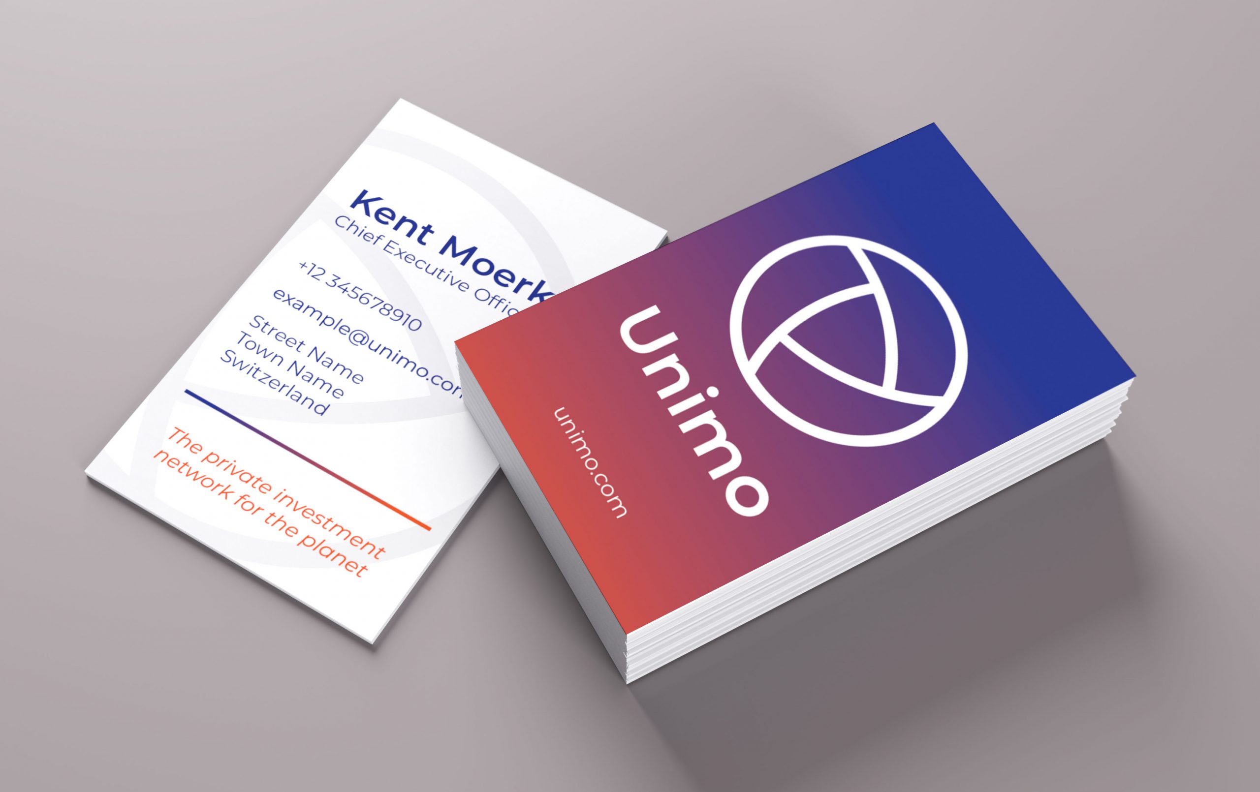
The brand identity has been applied to all touchpoints of the Unimo business, including new website, business stationery and presentation templates.
QUOTE
“I think the branding is absolutely awesome. Amazing job guys, it looks fantastic! Thank you very much.”
Hector Fresneda
Client Relationships Brand Director, Unimo


CONTACT US
KVB Design Ltd
47 Duke Street | Henley-on-Thames
Oxfordshire | RG9 1UR | United Kingdom

